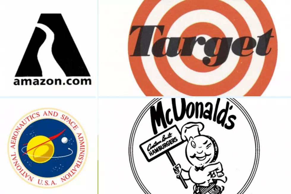
See 50 Famous Company Logos: Then and Now
Company logos are often one of the most recognizable parts of a company's branding message, up there with slogans and spokespeople. The Nike Swoosh seems almost as familiar to some consumers as a beloved cartoon character, synonymous with a favorite product or experience. Logos can signify a product to consumers with no need to convey any other additional information like a sales pitch or photograph.
With that in mind, Stacker rounded up 50 iconic company logos and took a look at how they've changed over time. While changing a logo may not affect a company's core business or offerings, it can definitely affect the way consumers see them and how easily they're recognized.
While most logos are updated to keep up with the times and trends, logos can also change or be discontinued because of controversy. In response to a wave of protests following the death of George Floyd, Quaker Oats and Mars on June 17, 2020, announced they would be removing racial stereotypes in their brands. Quaker Oats planned to no longer use its 130-year-old Aunt Jemima name or logo, while Mars said it would change its Uncle Ben's branding—although the company stopped short of providing specifics at the time.
A 2015 Nielsen study found that nearly six out of 10 people prefer to buy from a familiar brand. Rob Wengel, the managing director of Nielsen Innovation in the U.S., said In the introduction to the study that known brands "can signify quality and inspire confidence.” Whether it's a fast-food meal, plane ticket, or new car, Americans prefer to buy from a company they recognize and even admire—and a well-known logo can be one of the easiest ways to identify a familiar brand.
From Nike to Wendy's, read on to find out which company logos have gone under major redesigns and why.


