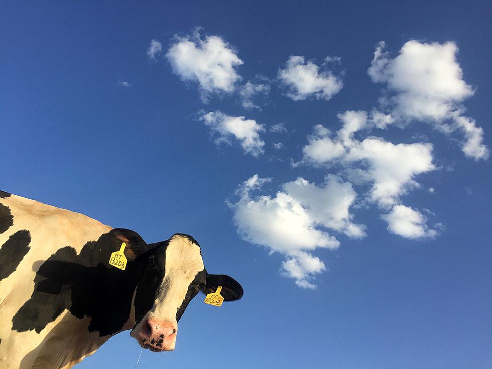
New Map Proves Northern Colorado Has Way Too Many Cows
I have to admit that I'm a little jealous. I've always thought of us as having the most and best cattle. If a new map is to be believed, the crown for most cows per capita should maybe go to northern Colorado.
First of all, this has become a highly entertaining conversation on Reddit which I definitely recommend. Before I editorialize, check out the map of cow density (yes, really) for yourself.
Notice that massively dark square in northern Colorado? That's cows. Lots and lots of cows. As is usually the case with Reddit, the comments are even more entertaining than the map. Here are some favorites:
mwing95 - "Each state seems to be separated by a line of cattle so dense it can't be crossed"
kenji-benji - "Disappointed when I read this as Castle density."
Pimmelberger_1234 - "Can we please have a map of CO2 emissions next to it?"
I knew it was only a matter of time before cow gas was mentioned.
The person who shared the original map also included details about how this map was created:
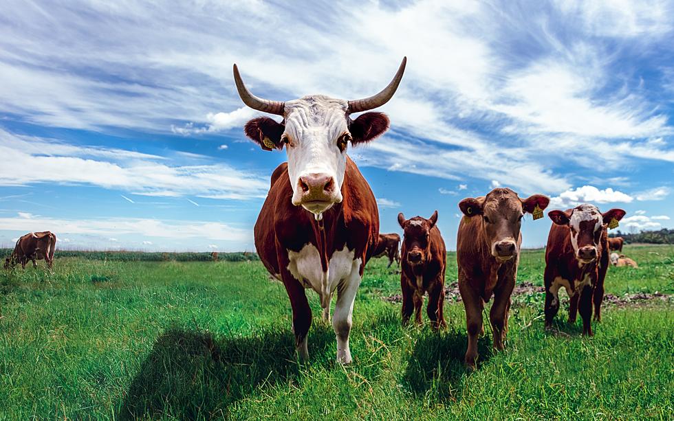
This county map shows the cattle density of each US county as a ratio of cows per acre. These numbers include both beef and dairy cattle.
So they used actual cow science? I am impressed. Check out the full Reddit post if you'd like to be enthralled with more bovine information that you likely already knew.
LOOK: 15 Discontinued McDonald's Menu Items
LOOK: 40 Discontinued & Special Edition Kellogg's Cereals
Gallery Credit: John Robinson
More From 101.9 KING-FM